Brand + Album Design

Frozen Inertia
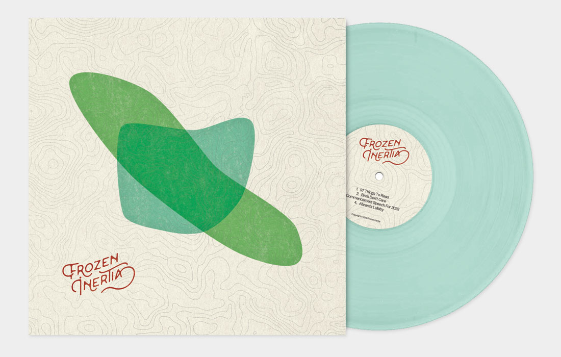
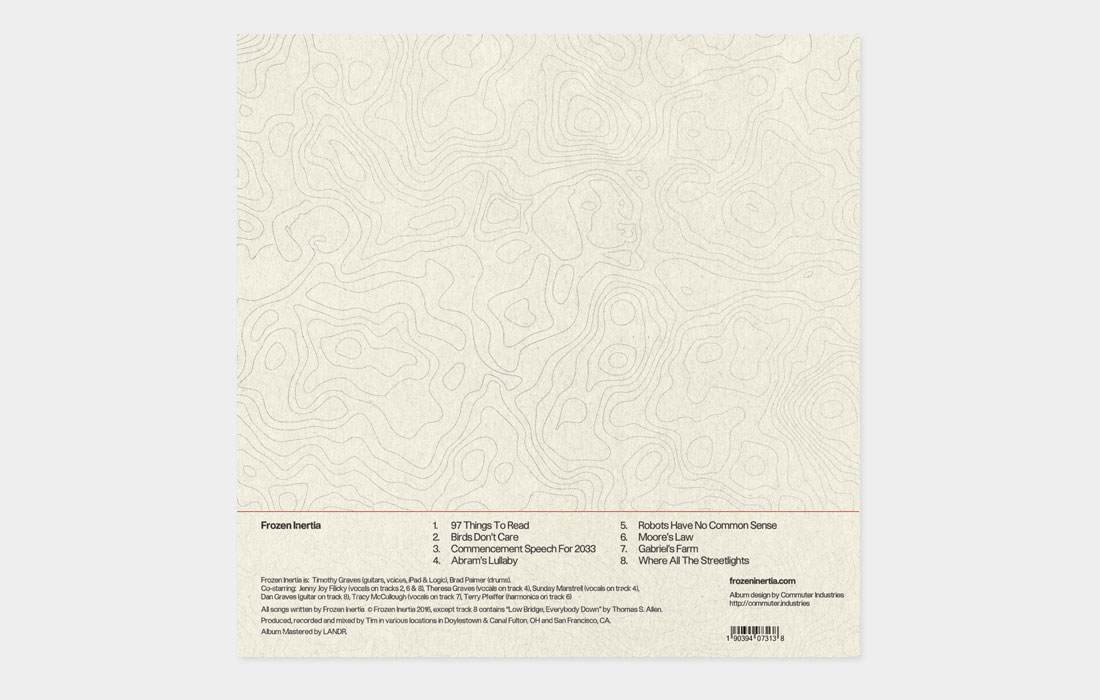
Frozen Intertia is a small independent band comprised of musicians from Ohio and California. The front cover and background sport an aged, mid-century-inspired aesthetic. The shapes are abstracted silhouettes of the states to honor the musician’s past and present, and as a direct nod to both places that are referenced throughout the album. The background design is a topographic map representing the hills and journey of life in Ohio and San Francisco, where the band is now based. The organic shapes of the background curve and weave rather unpredictably, referencing the fun, squiggly nature of the eclectic sounds and styles on the album. This curvy theme and vintage feel are both carried through to the design of the band logo.


