Branding + Packaging

AquaScreen
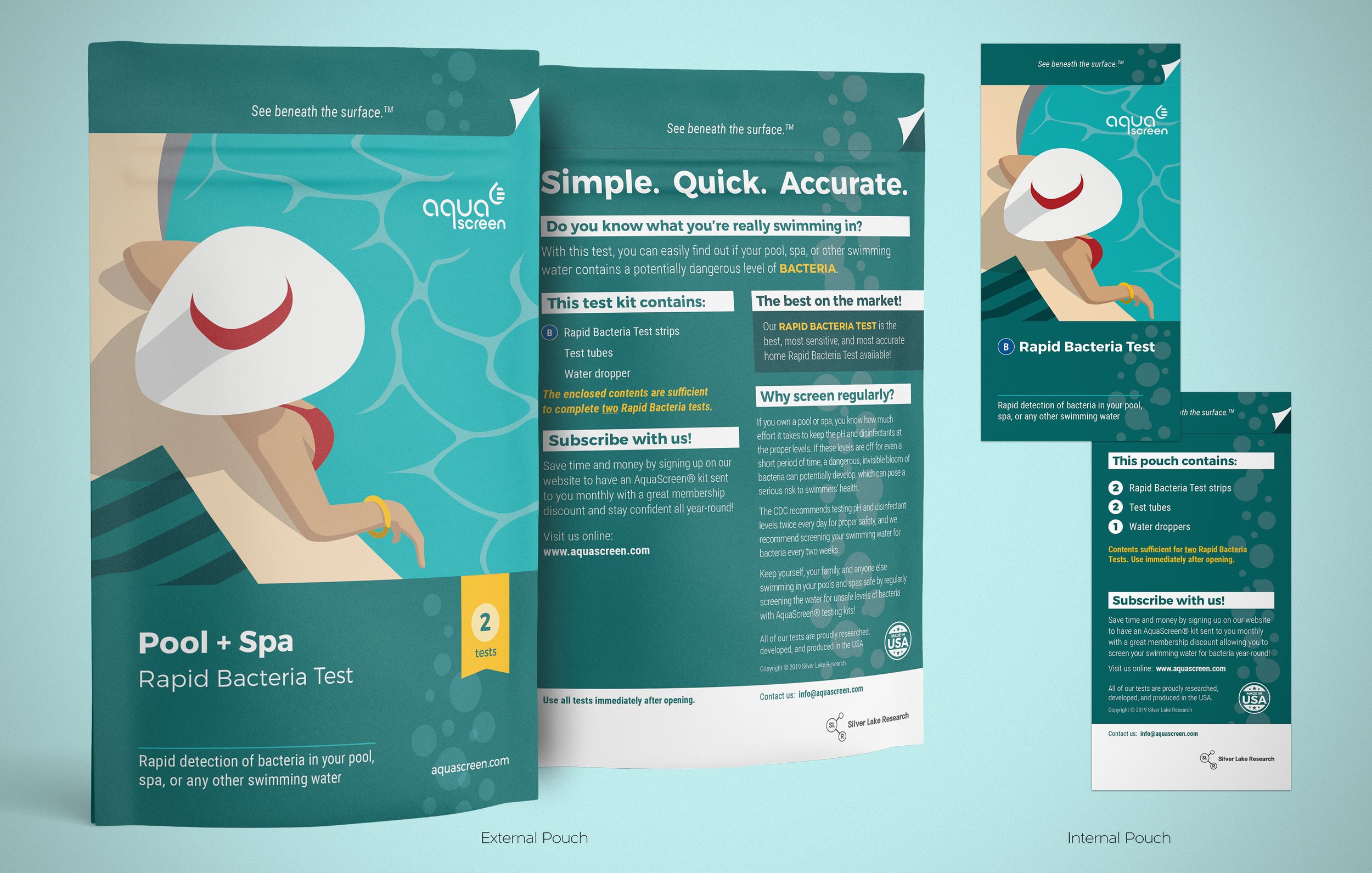
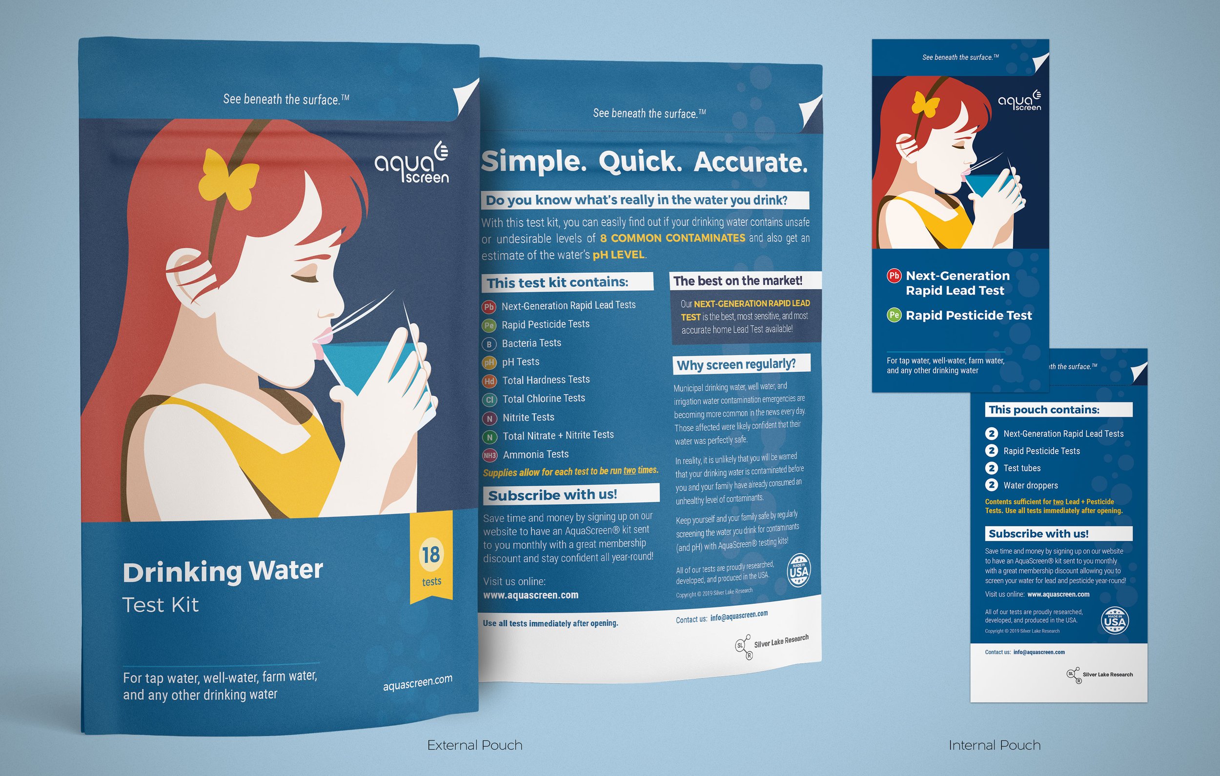
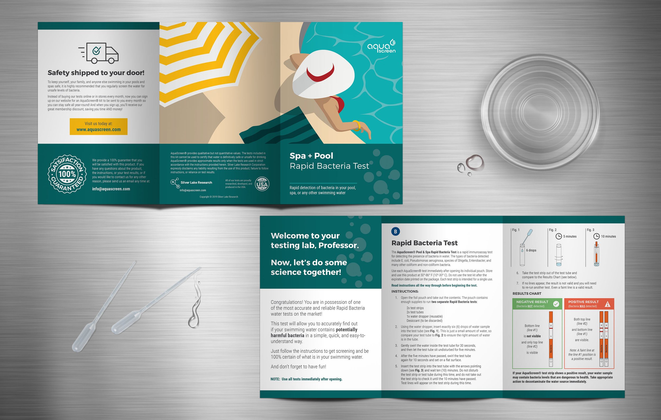
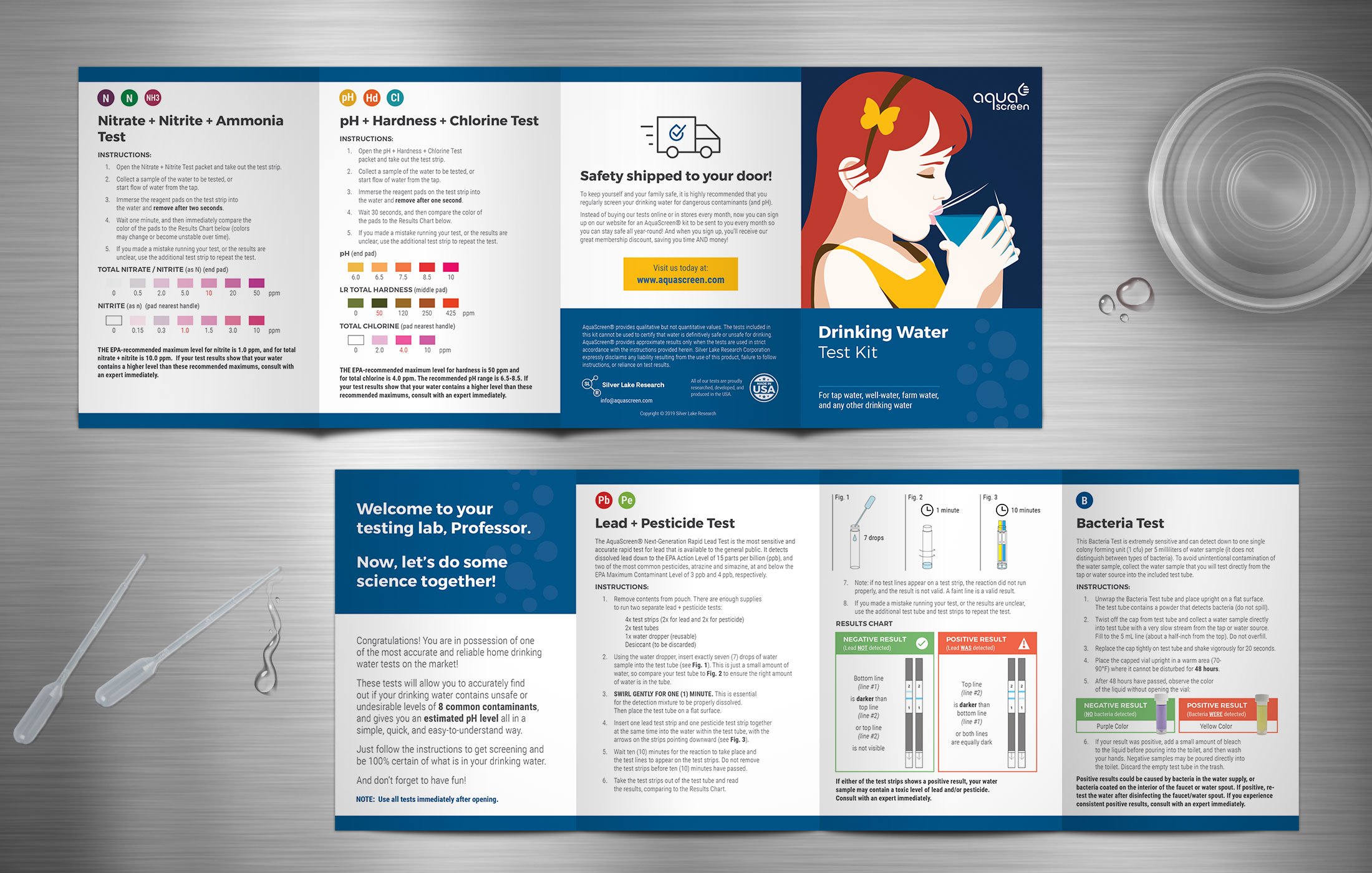
Silver Lake Research, specializes in a wide array of high-quality, highly accurate testing products across several different industries and was in the process of revamping and relaunching its at-home testing kits for pool and drinking water. We jumped in to help them come up with a new name, AquaScreen, and create a branding system that included a logo, general look and feel, and packaging. The brief: “How do we make water testing feel relevant, interesting, and easy without coming across as blandly corporate and overwhelmingly science-y?” The current water testing market is flooded with images of clear water swooshing across white, gray, or blue backgrounds and a giant logo somewhere. It gets the point across, but it certainly doesn’t make you remotely curious. So, our goal was to create something bold and artistic to grab people’s attention and contrast with the malaise of boring at-home testing products out there, while making the kit feel modern, reliable, easy, and straight-forward. For the logo, we created a custom typeface based on perfect geometry to communicate precision along with a clever icon that resembles, at once, a water drop, measurement lines on a science beaker, and a thumbs up for checking safety. To create the core style of the bold and colorful packaging illustrations, we drew upon our admiration of design legend Malika Favre. All of these elements combine to bring a little bit more joy and interest to the kitchen counter labs of citizen scientists everywhere.

